


Responsive Web Design That Delivers a Seamless Experience on Every Device
Responsive Web Design That Puts Your Users First
Your customers don’t just visit your website from a desktop computer anymore. They browse on smartphones, tablets, laptops and large desktop displays, often switching between devices throughout the day. That’s why every website we create is designed using a mobile-first, responsive approach, ensuring it looks and performs beautifully regardless of screen size.
At 2Cubed, responsive web design is built into every website we develop. Since 2011, we’ve been creating bespoke websites that combine outstanding user experience, accessibility, fast loading times and modern web technologies to help businesses engage visitors, generate enquiries and increase online sales.
Whether you’re launching a new website or redesigning an existing one, we create responsive websites that adapt seamlessly to every device while supporting your long-term business growth.
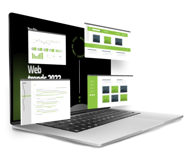
Responsive Website Design That Delivers a Seamless Experience on Every Device
Your customers expect your website to work perfectly whether they’re browsing on a smartphone, tablet, laptop or desktop computer. That’s why every website we create at 2Cubed is designed using a mobile-first approach, ensuring it delivers a fast, intuitive and engaging experience across every screen size.
Since 2011, we’ve been designing and developing responsive websites that combine outstanding user experience with technical excellence. Our experienced team carefully considers navigation, content layout, touch interactions, page speed and accessibility to create websites that not only look great but also perform exceptionally well for your users.
A responsive website does more than adapt to different devices—it improves usability, encourages visitors to stay longer, supports search engine visibility and helps turn more website visitors into enquiries, customers and sales.
Whether you need a brochure website, an eCommerce platform or a bespoke business application, we’ll create a responsive digital experience that reflects your brand, supports your business goals and grows alongside your organisation.


Responsive Websites That Make Every Visit Count
Today, most people will visit your website from a mobile device before they ever use a desktop computer. While many websites automatically resize to fit smaller screens, that doesn’t always create the best experience for your visitors.
At 2Cubed, we design websites using a mobile-first approach, ensuring every page is easy to navigate, quick to load and simple to use on smartphones and tablets. From intuitive menus and touch-friendly buttons to streamlined checkout journeys and responsive content layouts, every element is designed with your users in mind.
For eCommerce businesses, this means customers can browse products, add items to their basket and complete purchases with ease. For service-based businesses, it means visitors can quickly find information, make enquiries or book appointments without frustration.
By delivering a seamless experience across every device, a responsive website helps increase engagement, build trust in your brand and improve conversion rates, while also supporting your website’s performance in search engines.
Great Responsive Design Starts with Great UX
A responsive website isn’t just about fitting content onto a smaller screen—it’s about creating an experience that’s intuitive, engaging and easy to use on every device.
At 2Cubed, our responsive websites are designed with User Experience (UX) and User Interface (UI) principles at their core. We carefully consider how visitors navigate your website, interact with buttons, complete forms and move through key customer journeys, ensuring every interaction feels natural whether they’re using a mobile phone, tablet or desktop.
By combining responsive web design with thoughtful UX/UI design, we create websites that:
- Make information easy to find
- Improve customer engagement
- Increase enquiries and online sales
- Reduce user frustration
- Support accessibility best practices
- Build trust in your brand
A well-designed user experience doesn’t just look better—it helps your website perform better by encouraging visitors to stay longer, explore more pages and complete the actions that matter most to your business.
Every Responsive Website We Build Includes
- Mobile-first layouts
- Fast page loading
- Touch-friendly navigation
- Responsive images and media
- Accessible design principles
- Optimised forms and calls to action
- Cross-browser compatibility
- SEO-friendly development
- Flexible content layouts
- Ongoing support and maintenance
Why Businesses Choose Mobile-First Web Design
Today’s websites need to do more than simply look good on a mobile phone. They need to provide a fast, intuitive and engaging experience that encourages visitors to take action.
When we design responsive websites at 2Cubed, we focus on:
- Creating intuitive user journeys that help visitors find information quickly.
- Improving website performance with fast-loading, optimised pages.
- Supporting accessibility to make your website usable for a wider audience.
- Increasing enquiries and sales through thoughtful UX and clear calls to action.
- Building future-ready websites that grow alongside your business.
- Maintaining a consistent brand experience across every device.
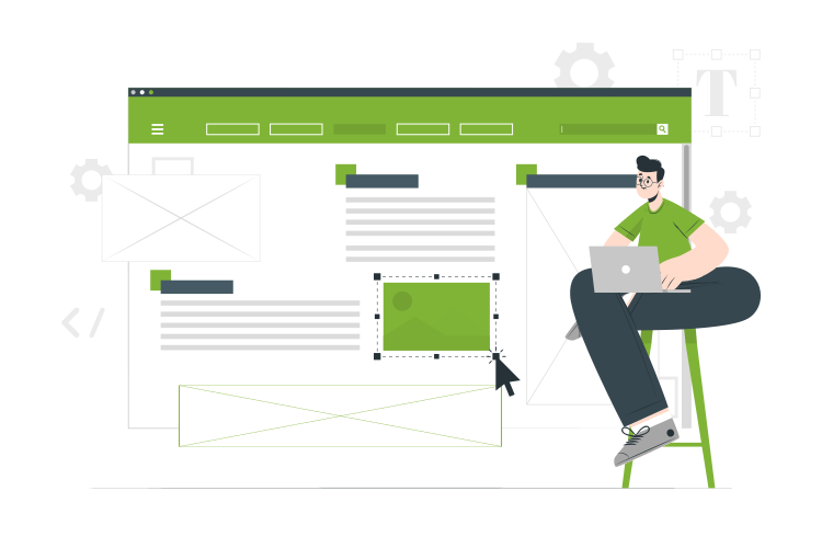
Why Choose 2Cubed for Responsive Web Design?
A great responsive website is about far more than adapting to different screen sizes. It should help your business attract more visitors, build trust with your audience and turn those visitors into customers.
Since 2011, we’ve been designing and developing bespoke websites for businesses across Wexford, Dublin and throughout Ireland. Every project is carefully planned around your business goals, ensuring your website delivers an outstanding experience on every device while supporting your long-term growth.
A Bespoke Website Designed Around Your Business
We don’t rely on generic templates. Every website is designed to reflect your brand, engage your audience and provide a seamless user experience across mobile, tablet and desktop devices.
Mobile-First User Experience
Today’s customers expect fast, intuitive websites that are easy to use wherever they are. We design every page with mobile users in mind, creating clear navigation, well-structured content and simple customer journeys that encourage action.
Built for Performance
Fast-loading, responsive websites help keep visitors engaged and support better search visibility. We focus on performance, accessibility and modern development standards to ensure your website performs at its best.
Designed to Grow With Your Business
Your website should be able to evolve as your business grows. Whether you’re adding new services, launching an online shop or integrating with other business systems, we build flexible websites that are ready for the future.
Ongoing Support You Can Rely On
Launching your website is only the beginning. Our experienced in-house team provides ongoing website maintenance, technical support and digital expertise to help keep your website secure, up to date and performing at its best.
A Proven Track Record
We’ve helped organisations of all sizes create websites that deliver real business results. From local businesses and growing companies to charities, education providers and public sector organisations, we’re trusted to deliver high-quality digital solutions backed by long-term support.
Ready to Create a Better Website?
If you’re looking for a responsive website that’s designed to engage your audience and support your business goals, we’d love to help. Speak to our team today to discuss your project, explore our portfolio and discover how 2Cubed can create a website that’s built for long-term success.
Frequently Asked Questions
Responsive website design ensures that the layout of the site is flexible and responsive to the format in which it is being accessed. Ensuring that regardless of the device that you are using to access the site that the user experience is the same. Responsive website design ensures that your website works on all devices mobile or desktop. We employ responsive web design on all of the sites we develop.
Responsive web design works by developing web properties so that regardless of the device used to access the site will be displayed exactly the same.
2Cubed understands that responsive web design is essential for a business to survive in the digital age.
2Cubed can help you by using responsive web design to improve the overall user experience of your site and ultimately generate more revenue.
Absolutely. Google prioritises mobile-friendly websites in its search results, so having a responsive design can improve your SEO rankings and help you reach more customers online.
In many cases, yes. We can assess your current website and recommend the best approach, whether it involves adapting your existing design or creating a new, fully responsive website that meets modern standards.
Loading secure enquiry form...