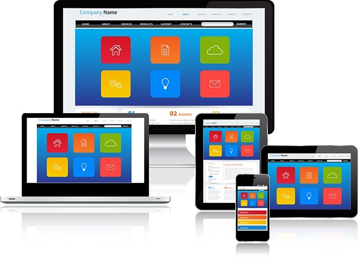
We are seeing some really nice responsive websites that are being created properly and giving customers a full mobile experience, instead of a light version of the website that has little value for your customers. We are seeing many businesses replacing their standard main menu with a responsive-looking burger menu on their full-width websites, but like many things, this probably will just be a fad that disappears as quickly as it arrives – they work great on mobile, but are just frustrating for desktop users!
When it comes to Payment Gateways on eCommerce websites, there is a trend to offer multiple payment options for customers to choose the one that they are most confident in.
Scrolling sites are still there but on desktop it’s still a bit of an issue. We have come across some clients not knowing to scroll down when they see a large banner image and think this is the only thing on the page. So be careful to show a little bit more than the banner, so that customers know to scroll down if they are supposed to. It’s fine on mobile as experience has taught us that mobile users don’t mind scrolling when browsing.
We have seen a bit of a buck in the trend for large banners that take up too much space. Companies want to get the information to the customer as quick as possible and are trying to get their message across quickly and efficiently rather than wasting a chunk of the screen on one message. Some people will never see the second and third banner because they are impatient, and have already clicked away.
Fixed-width centre-aligned design still works but in a much more clever way. It looks to be 100% size of the screen. Responsive design has really helped to show different views for different screen sizes. Instead of sites (and their content sections_ going all the way to either side of the viewport, some sites are opting for a max-width to keep their content centred in the viewport.
Photographers seem to be kept busy these days with much more value in having custom photography rather than stock photography displayed on websites. It makes much more sense to follow this approach, as customers prefer to see real company shots on the website.
With typography on sites, fonts are getting even larger than 2014. This enhances the visual hierarchy of content and breaks up the page giving an overall better user experience.
Give us a shout if you want to discuss any of the above. Hopefully our insight helps you when you are working with your chosen developer designing your website!


