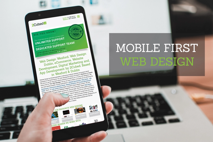
Mobile first web design is exactly what it sounds like, it is the practice of designing first and foremost for the smallest screen compatibility possible and then working your way up from mobile to desktop etc..
The idea behind this practice is that by taking this approach you have designed your website to be a responsive and very adaptive design. This is because you would have taken the approach that is called ‘progressive enhancement’. Progressive enhancement is the strategy that since mobile design is generally the most difficult to do that you should actually do it first and then when you have to design for other devices you will find it a much easier process. The great thing about this approach is that since you have made mobile first web design a priority and since smaller designs will have only essential features you have at the core already the heart of the user experience you’re offering.
The opposite approach of progressive enhancement is called ‘graceful degradation’. This would be considered a more old-fashioned practice. Graceful degradation entails building a website that incorporates everything from the start and then starts to strip away parts at a later stage for compatibility on smaller devices. The bad thing about graceful degradation is that it treats mobile compatibility as an afterthought or almost a nuisance and you are cutting down on the quality for the mobile version so you nearly end up with two different websites. The one on desktop is a proper effective one whereas the mobile version ends up looking like a pale shadow of the former.
Google now actually indexes sites on a mobile first approach which means they are first ranking your site on how responsive and how well designed it is for mobile, so you can understand if you took the graceful degradation approach you have already shot yourself in the foot as your website will not rank as well as google will judge it poorly even though your desktop site might very well be perfect. We of course then like everyone else recommend that you always take the progressive enhancement mobile-first approach and make mobile a priority not an afterthought otherwise you will live to regret it.
When your site looks great on a mobile device, it will translate brilliantly to all other devices. Also when you design for mobile first it’s limitations are forcing you to cut to the heart of things and really prioritize your content. This is unintentionally helping you to make your website better and deliver the ultimate user experience as since you are designing under such tight parameters your site will be very content-focused which in turn means its user-focused. Google will look on you very favorably if you’re offering the user a great experience and you are because you have been forced to cut to the heart of things, and that’s what the user wants, not to be distracted with all the bells and whistles but access straight away to the content they were searching for!
What first seemed like a hindrance is actually an unlikely but extremely helpful ally, design your website with a mobile first approach and you have taken the first step to having a successful website, on all devices!
For more advice and information on having a successful website get in touch with 2Cubed today!
Please feel free to follow and interact with us on the following profiles.


